How To
How Differentiated Packaging Helps Food Brands Stand Out?
 Under the background of enlarging food and beverage categories and fierce competition between similar products, brands are emphasizing greatly on the “differentiation” of their products. For example, healthier ingredients, like natural sweeteners, are used more often than before so as to reduce the unhealthy risks for consumers; functional products are gathering their popularity, such as dream water, artificial meat, facial beauty and weight management, etc; classifications of different consumer groups like Generation Z, silver generation, single economy have provided a more targeted direction for product R&D…These differences can be extended to follow-up commercial marketing points to tell a good product story and attract consumers.
But wait a minute, before that happens, a more direct and front-line differentiation strategy has not received enough attention, which is innovative packaging that breaks the rules and smashes the consumer’s stereotypes. Creative packaging can capture the attention of consumers right away. Compared to spending much time, energy and money on developing and convincing consumers into accepting a new product concept, it can more effectively help brands stand out among similar products.
In Marking Awards 2020, we are delighted to find some designs that break through the traditional perceptions of consumers and are able to gain favorable market results. Now, we have selected 12 entries with differentiated packaging, with a hope to offer inspiration to brands and agencies that are actively seeking “innovation”.
Note: In order to maintain the objectiveness and fairness of entry evaluation, works demonstrated will only have their product name revealed and no participant-related information shall be revealed in principle.
Selected Entry Appreciation
1. Coloreat
 As an old Chinese saying goes, “the whole day’s work depends on a good start in the morning.” It is said that the energy of breakfast accounts for 30% of that required by the human body for the whole day. Thus, breakfast is of great significance. It is well understood by adults, but for children who are naturally active, sitting to eat breakfast or any meal can be uncomfortable and painful. So it is a big trouble for parents to let their children have a good breakfast.
Coloreat is a child-oriented jam. In foreign countries, jam is an important part of the traditional breakfast. This package aims for children eating jam at breakfast.
How to make children enjoy breakfast? The key is fun.
The design agency innovatively combines the breakfast jam with the palette of painters, and each “palette” package can hold jams of 5 different flavors (strawberry, fig, pumpkin, peach and Feijoa). Moreover, the sugar intake is just in line with the recommended intake. These delicious jams look like colorful pigments. Children can use the spoon as a brush to draw on their imagination on the canvas-like toast. Children’s imagination and creativity can also be stimulated while having their breakfast.
The jam naming and the marketing are very simple and straightforward. Bright and interesting packaging differs from the common jam on the market, which breaks the child’s conventional view of jam. Consequently, a breakfast with jam has been turned into a creative art game and an expected daily ritual.
2. Luxerose
I’d like to ask all the independent women a question: when you finish one day’s work, or have a small gathering with friends on weekends, or when you read at home alone, you suddenly want to have a drink, then you walk into the supermarket, but what you can find are only industrial beer, heavy red wine and cheap drinks filled with artificial flavors on the shelves, do you feel that you don’t want to buy them at all? Alcohol drinks are products with strong personalities, and they have been growing into many kinds, but surprisingly, you can hardly find one kind of liquor that caters to women both with its brand concept and packaging design.
 The number of women in the workplace is growing with their sense of independence enhancing. No matter the fresh newers or those experienced woman warriors, they all need a type of alcohol drink made for women which can represent the independence, exquisiteness and elegance of contemporary women’s lifestyle. Luxerose is the one.
Based on product positioning, the design team regards the portability and the high-level exquisiteness as the basic.
With “Enjoy Yourself” as their cultural foothold, they expresses the sense of fashion and trend in the brand and packaging design as well as products and related market promotion, to develop “enjoy yourself” as a hot topic.
Use a test tube to carry cocktails of different flavors, a cigar-like iron box to manifest your attitude of “enjoy yourself” and independence. Different illustration styles on the surface of the boxes can be extended to unlimited possibilities of visual themes.

3. Boon Bariq
Boon Bariq is a jam product that has a higher percentage of fruit and berry compared to other jam products. Then how to maximize this competitive advantage?
By studying numerous ways of illustrating fruit and label designs, the design agency identified that many brands use a quarter or half of the jar surface to illustrate fruits and present the brand message.
In order to distinguish them from the same type of products, the designers came up with a simple solution: wrap the whole jar with fruit peel. Looking at the fruit in the orchard or in a supermarket, we are drawn towards those fruits that are ripe and have an attractive look. It is the best packaging design.
So, the agency decided to transfer the same appetizing fruit peel concept onto a jar. Technically, it was possible to achieve by using a shrink sleeve label. It allowed the design to cover nearly the whole surface of a jar leaving the bottom of the jar transparent to make the product visible.
 Different from the popular pickled food packaging in the market, it ensures that this product has a unique visual impact when placed on the shelf, and the colorful appearance helps the product stand out. At the same time, the design of the peel and the natural essence of the product resonate perfectly, showing the core of the product.
4. Hans & Gretel (Candy Store)
Hans & Gretel candy store not only sells desserts, but more importantly, fun, innovation and fancy. They are committed to creating a fairy tale world full of magic for kids and adults.
Unlike the popular minimalism which advocates “less is more” principle, the design of this candy house is “extremely complex”, presenting full happiness and joy in exciting and eye-catching packaging. The designers use fantastic styles, bright colors, and maximize design elements to create attractive visual effects. At the same time, the interesting packaging can also immerse consumers in it and turn them into adventurers, exploring the sweetland heartily.
5. Rice Man
From the early childhood, we have learned the Chinese poem “who knows the food on the plate, each and every came from peasantry’s hard work”. However, after reciting it for many times, we gradually become numb. This poem gradually became the slogan hanging on the mouth, and did not play a real role in convincing others into saving food. Indeed, facing with sacks of rice, it is always difficult to think of the hard work of peasants.
But imagine, what if rice had feelings?

The design agency hopes to pay tribute to the unnamed people who work hard in the fields by means of packaging, and to show the interesting and inspiring nature of rice during the process of its growth in a humanized way, thus establishing an emotional connection with consumers.
To perfectly represent this simple and familiar grain, the design agency decided to capture the facial expressions of the rice farmers with the simplest black lines: confidence, pride, satisfaction, empathy and tiredness…By depicting the different emotions experienced by rice farmers, the pictures give the product a strong emotional attribute.
Functionally, the design agency chose two different sizes of bags to visually and intuitively inform consumers of the type of rice in the bag: the small bag for short-grain and the tall one for the long-grain.
As for the material, they went for the sustainable option with the use of a high density sackcloth fabric to contain the rice, and the carton lid in the form of the Asian farmer’s traditional conic hat.
Make things easy for the consumer, on the inner side of the cone hat are marked rice cup measurements. Continuing with tribute to the human involvement behind the rice product, they have chosen the name Riceman as a way to immortalize his identity on their brand. As for the graphics and visual writing style, an Asian calligraphy is selected for logotype to emphasize the regional origin of this grain.
Facing the adorable rice packaging, won’t you feel guilty to waste it?
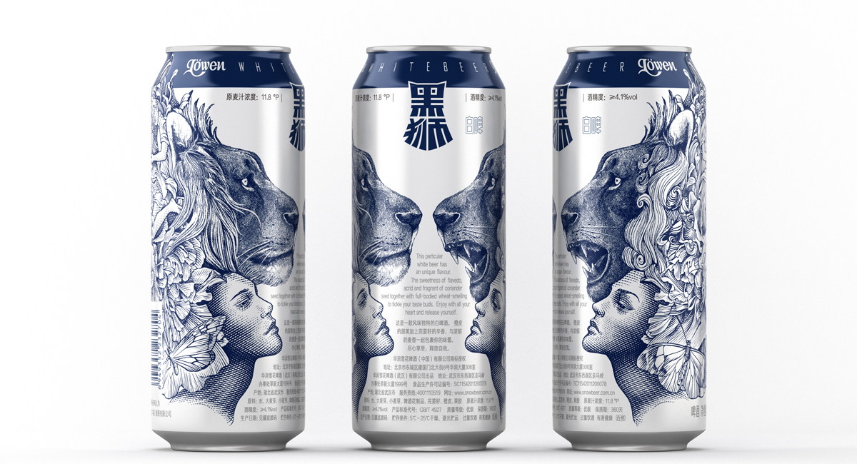
6. Löwen Beer
Löwen Beer targets at young people who pursue different personalities and are willing to try new things.
The design team made use of bold imagination on the packaging illustration: the different expressions of the two lions conveyed two different emotional expressions of human before and after drinking – restraint and enthusiasm. They bypassed the cylindrical cans and approached close to each other, like two people who are communicating face to face. The moderate white space between the illustration and the can body creates a good buffer visually.
 The simple blue and white color also neutralizes the complex and rich texture of the sketch and copperplate illustrations, while making the wine look more refined and distinguishable from other canned beers on the market.
7. Jingyang Brick Tea Packaging
The brick tea of Jingyang, Shaanxi Province has a history of more than 600 years and is known as the “black gold on the Silk Road”. However, due to the backward local economy and lack of packaging awareness, there are difficulties in the promotion and dissemination of Jingyang Brick Tea.
The designers decided to show the hidden Shaanxi merchant culture and local folk customs in the late Qing Dynasty behind the Jingyang Brick Tea: the merchants traveling through the market and the suburbs on the back of horses, local snack vendors, folk artists, scholars who prepared for the test, the mother with their children and other life stories.
 It is worth mentioning that the local culture is not only reflected in the packaging, the expression technique also reveals the inheritance of traditional culture. The packaging adopts three kinds of classic colors of Chinese traditional paintings, green, blue and red, to package three different levels of tea bricks. The bottom is made of tea tickets circulating in the late Qing Dynasty as a sticker. The handmade Xuan paper made of natural materials is finally formed into packaging paper of brick tea by manual paper-fishing-up, paper-basking, paper-cutting and other crafts. As a packaging material, it is waterproof which can protect tea well.
The designers also invited the rare female artificer in the industry to use the pure hand-engraving printing process to print the pattern, including the steps of sampling, engraving, replenishing, emptying, removing, polishing, coloring and rubbing the board. The back of the package is in the form of a hand-engraved stamp with a picture embellishment. The process of packaging has promoted the inheritance of China’s intangible cultural heritage.
The rubbing pigment, bonding glue and the binding straw are all made of natural raw materials. The portable straw rope’s structure replaces the tote bag, tracing back to the original, which is environmentally friendly and material-saving.
8. PLAY NOW Small Liquors Packaging
When it comes to small liquor packaging, Jiang Xiaobai is the first choice of many people. Its heart-warming copy has triggered consumers’ recollection of youth. If Jiang Xiaobai is like a youth who appreciates art, then Play Now is like a social butterfly, born for the party.
Liquor plus social would inevitably remind people of “Chinese toast culture” which is exhausting and harmful. Different from that, Play Now is created for young generation, aiming at avoiding these embarrassment and boredom.

PLAY NOW uses a double-layered label structure to carry out the “play” design concept, and tear the first layer of the label to see the internal wine order. When you open the package, you can see the internal wager game. The wager game of each small liquor is different. Four different themes wager game can activate the atmosphere on the party no matter what the occasion is.
It is also different in structure from other small liquors. After repeated proofing, it finally adopts the innovative structure of the distorted bottleneck, which is different from other similar products on the market. The bottle can only contain 50ml, which is easily portable and suitable for parties.
9. Huaguoshumu Enzyme Beverage
 Targetd at the Generation Z who dare to try and are willing to accept new things, Huaguoshu enzyme beverages are approaching the aesthetic of them in both label and structure.
In label, the extremely minimal design reflects the natural characteristics of the product, highlighting the personality of the era on the basis of the Generation Z’s aesthetic pursuit.
In terms of bottle structure, unlike the high-thin bottle of enzyme drinks on the market, the design team chose a chunky type, emphasizing portability and differentiation, conforming to the taste of contemporary young people.
 10. Water in Plants
Water in Plants is formed by the condensation of water vapor generated during the vacuum drying process of rose tea.
Nongfu Spring’s glass bottle has defined the shape of high-end water domestically, and also built consumers’ knowledge of high-end water. Under this circumstance, how can brands spread the product characteristics, convey the high-end texture to consumers and attract young consumers at the same time?
The design agency imprinted the texture of rose on the bottle cap and adopted relief sculpture to better conform to the attributes of the product, forming a direct recognition and attractiveness.
In bottle structure, a long and tall bottle type is designed according to the best holding way of the bottle by female, which is more ergonomic. Colors are also differentiated according to different flavors. The product name is located in the middle, not only to attract consumer’s attention, but also to enhance the audience’s memory of the product. The entire design creates a high-end and compact image with a high level of recognition.
 11. Lyfen Newy Jerky
Lyfen Newy Jerky is a beef snack aimed at young people to supplement energy.
Guided by consumer interaction in packaging creativity, the inspiration is taken from the scene of kid leading a bull when we were young. The main picture on the package is a bull’s head and an upturned bull nose ring.
Holes are punched on the ring to form a scene of an upside-down cow head when displaying on the shelf, letting consumers have an interactive experience of pulling the cow forward and a dynamic association of strong characters through different expressions.
The packaging color is mainly black and red, and the wild image fully expresses the product’s attribute, interacting with the consumers through the visual association. It is different from the common beef jerky products on the market, making it easier to be remembered.
12. HUANG DI NEI JING LIQUOR
 HUANG DI NEI JING Liquor inherits health care concepts from Inner Canon of the Yellow Emperor, advocating that modern health keeping doesn’t equal to eat tonic, but to develop a good lifestyle and always maintain happy mood.
The design inspiration of HUANG DI NEI JING Liquor is derived from the core concept of “Yin and Yang, the way of heaven and earth” in the classic Chinese book Inner Canon of the Yellow Emperor. The solid circle is solar, symbolizing heaven, and the dotted circle means lunar, symbolically reflecting the brand idea of the liquor.
The packaging combines square and circle, with white as the main color throughout the entire design. The inclusiveness of white reflects the product’s oriental aesthetic taste. “A deer biting a ganoderma” is adopted from Chinese traditional allusion to represent auspiciousness. The product’s features and its packaging design have achieved a high degree of unity, which can leave people deep impression.
Summary
Back to the discussion on differentiation at the beginning of the article, under the background of more classified products, brands that want to quickly stand out need innovative packaging. But 50% or even more of the packaging is difficult to stand out finally on the market. How to let differentiated packaging work and ultimately influence consumers’ decision-making? Through observing the works above, we can summarize the following points:
- Combine product characteristics, express brand values and maximize competitive advantages;
- Fully understand the preferences of the target consumers, focus on consumers’ needs and cater to them.
So far, as the only one packaging design award focusing on the food and beverage industry on the globe, Marking Awards is dedicated to exploring the value of design. We will continue to report on the excellent entries of Marking Awards 2020, hoping to bring inspiration to the whole industry.
Application
Marking Awards 2020 is accepting global design works of four categories: label design, structure and material design, product design and brand full case design. Design agencies, brand owners, packaging companies, advertising agencies are all welcome to enter. Sign up before November 30th to enjoy the final discount!
Download the Application Guide or View Previous Entries
Previously published on FBIF