How To
22 Packaging Designs Uncover Consumers’ Aesthetic Secrets
 Winning consumer appreciation has always been the ultimate appeal of products.
Consumer portraits based on big data have made brands gradually realize that consumer segmentation, diversified consumption scenarios, and multiple consumption purposes are taking place. Brands have to face the problem that when the consumer market is sufficiently transparent to all brands, how to make your target consumer group find the advantages of your product at first glance?
Based on different consumer groups, this edition selects 22 entries from Marking Awards 2020 that have established effective communication with the target groups. Welcome to explore with us how should packaging design, the first step of product and consumer communication, take separate strategies according to different target consumer groups.
Contents
- Sober and Independent, Considerations of the New Middle Class
- Picky and Difficult? Do You Really Know the Spiritual Needs of Gen Z?
- Opportunities Outside First-tier Cities
- The Ultimate Care of Novice Moms
Note: In order to maintain the objectiveness and fairness of entry evaluation, works demonstrated will only have their product name revealed andno participant-related information shall be revealed in principle.
Sober and Independent, Considerations of the New Middle Class
The emerging new middle class is becoming main consumption group. For young and promising middle class and a broad mind, choosing a product is not following others’ steps, and a good appearance without soul inside is not necessarily righteous. Behind each purchasing behavior is a process of sober and independent thinking and a choice towards refined lifestyle.

1. Lind & Lime Gin
Lind & Lime Gin is a gin with lime flavor. Lime wine originated in 1747. While working as a surgeon onboard HMS Salisbury, Edinburgh born Dr. James Lind proved the consumption of citrus fruits to be the most beneficial remedy against scurvy.
This became a revelation for the health of Royal Navy seamen. In order to preserve lime juice to keep it fresh on board for months, lime wine appeared. Furthermore, Lind and lime gin became a perfect maritime tribute.
Leith’s shores were once home to a plethora of industries which is where inspiration has been drawn for the design and detail applied to the bespoke bottle and packaging of Lind & Lime Gin. The strong, elegant, and long necked bottle with its unique shape, combined with the embossed depiction to this factory stamped firmly at its base, looks like the conical chimneys from the Edinburgh and Leith Glass Works rising above sea-level.
The design team specified half white glass with its translucent light green hue to epitomize the citrus tones of the gin. The glass bottle has a unique outline to show its sense of dignity. They’ve also used the negative space around the bottle to leave breathing space for the design.
The bottom label is made of delicate embossed paper, and the product information is arranged in order according to the criticality. This historic gin gives consumers a sense of sophistication and dignity, and stands out when displayed alongside other similar products on the shelves.
 2. TONIQ
TONIQ is an intelligent and light sparkling coconut water, rich in health elements such as magnesium, ginger juice, and probiotics, specially designed for fitness people.
Unlike common high-sugar sports drinks on the market, coconut water is loved by fitness enthusiasts due to its dual effects of nutrition and hydration, and has gradually become the main dietary source for fitness people.
TONIQ not only achieves lighter taste, richer nutrition, rich in vitamins in the product itself, but also broadens the consumer’s drinking experience through a more expressive look and feel to open up the drinking experience and secure a dynamic entry into the wellness space.
The letter “IQ” on the bottle cap emphasizes the power of this new type of smart coconut water, and the stylish rose gold bottle cap creates a sophisticated and superior sensory experience.
The brown glass bottle symbolizes the brown coconut shell and helps protect the beverage inside. The unique embossed visual recognition of the bottle body conveys the lightness and softness of the inner coconut, highlighting the lightness of the beverage. Holding the bottle opens a different consumer experience.
The glass bottle can be completely recycled, and consumers can also return the glass bottle to the gym for reuse, meeting current consumer expectations for sustainability.
3. BEARFACE
BEARFACE is an innovative Canadian whiskey brand dedicated to creating truly unique blended whiskies, changing consumers’ old impression of Canadian whiskey, and allowing consumers to express their age, creativity and contemporary worldview through whiskey.
 The unique paw print design of the bottle body shapes the core brand logo, which is inspired by the courage and strength of Bear. It locks the core spirit of the brand. Other key brand assets such as websites, posters, wooden containers and coasters are appropriately showing the brand identity.
The warm and charming palette is inspired by the characteristics of Canadian landforms, while subtly borrowing Canadian national colors.
Bold typography and authentic illustrations are based on marks made from hand-chiselling wood and have been transferred digitally to preserve a crafted aesthetic with a more modernised look and feel. Meanwhile, lifestyle photography feels energetic and shot from the hip – with a focus on urban Canada and the modern Canadian spirit, representing the brand’s target audience and the brand’s ‘HIDE NOTHING, FEAR NOTHING’ mentality.
 4. Cîroc Limited Edition White GrapeVodka
British alcoholic beverage giant Diageo launched this Cîroc limited edition white wine vodka, which is for sale during the holiday season.
The design team was inspired by the gold and silver elements commonly used in holiday decoration, and inspired by champagne and white wine, and finally chose a luxurious soft gold bottle body that matched the glittering sphere on the top. The pattern on the bottom of the bottle was a rooster medal.
This beautifully crafted vodka is perfect for gathering with friends to celebrate the festival.
5. Buchanan’s Two Souls Whisky
 Buchanan’s is one of the most revered scotch whisky brands sold throughout Latin America. For over 130 years, this Scottish distillery has been crafting unique blends enjoyed by whisky aficionados in Mexico, Central, and South America.
“Two Souls” is a tribute to the strong bond that exists between Buchanan’s generous spirit and the poetic and festive soul of the Mexican culture. The design team wanted to maintain Buchanan’s key branding assets while giving a meaningful homage to Mexican culture and spirit.
To create a strong visual identity for this extraordinary innovation, we crafted a black matte label that incorporates a single, brilliant point of focus: a vibrant teal agave plant illustration that glows in the dark. The charcoal gray packaging, highlighted by touches of teal, reinforces the status of this new expression.
The new design brings the perfect balance of authenticity and vibrancy, creating a modern and unique addition to Buchanan’s collection of fine spirits.
6. Intelligentsia Coffee
Intelligentsia Coffee is selected from the origin of excellent coffee beans. It has established its leading position in the coffee industry and has become one of the consumers’ preferred brands, but the previous design failed to convey the brand’s high-quality image.
Starting with the identity, the design team refined the wings and eye of the logo along with crafting the word mark for optimized legibility and sizing across the system. Creating icons for the sides of the bags helps deliver clear, simple direction on preparing the perfect cup of coffee rather than copy-heavy directions. Overall, the design wanted the outcome to feel more personal and approachable – just as Intelligentsia strives to welcome and educate their consumers about coffee.
 Every Intelligentsia coffee bar is localized and unique, so the design team provided each seasonal variant with a similar, unique expression. For example, ‘Persephone’ visually represents the freshness of spring and the convergence of seasons through a brighter palette, contrasting shape patterns while the colors and leaf illustrations of ‘Otono’ capture the depth and richness of fall.
The new design expression allows variants to make a clearer visual connection with one another as a portfolio through purpose and specialization, while continuing to distinguish itself from the oversaturation of today’s craft-heavy aesthetic. Each bag democratizes the passion for artisanal coffee, giving equal priority to the whole product range, by educating consumers on provenance and seasonality in a clear and coherent manner.
 7. T9 LEGEND
Oriental tea attaches great importance to the origin. This tea series is a set of tea leaves from different origins. The brand wants to tell the stories of the origins by packaging, and resonate with consumers.
After combing through the commonalities of different origins, the design team found that each origin has its own unique cultural totem, such asthe dragon at the Wuyi Mountain, Fujian South China Tiger, Yunnan Peacock, Taiwan Elk Deer Elk, and Indian Elephant.
Through discovering and refining the historical and cultural totem of the origin of each tea, this packaging design is drawn in the form of Chinese Meticulous painting combined with hot stamping and stimulus, the result of which is really vivid. The new series has added orange edges, strengthened brand recognition, and improved shelf recognition.
Pickyand Difficult? Do You Really Know the Spiritual Needs of Gen Z?
On October 22, 2019, the brandrating authority Chnbrand released the 2019 China Customer Satisfaction Index SM(C-CSI®) analysis report, pointing out that among all generations, post-95 (GenZ) satisfaction was the lowest, followed by the pre-70s.
With the growth of the Internet, GenZ’s “self-expanding needs” are highly inflated, including a sense of belonging, identity, and a strong desire for self-expression. As a result, these needs have not been well met, but in fact, to a large extent, this can rely on packaging design to solve.
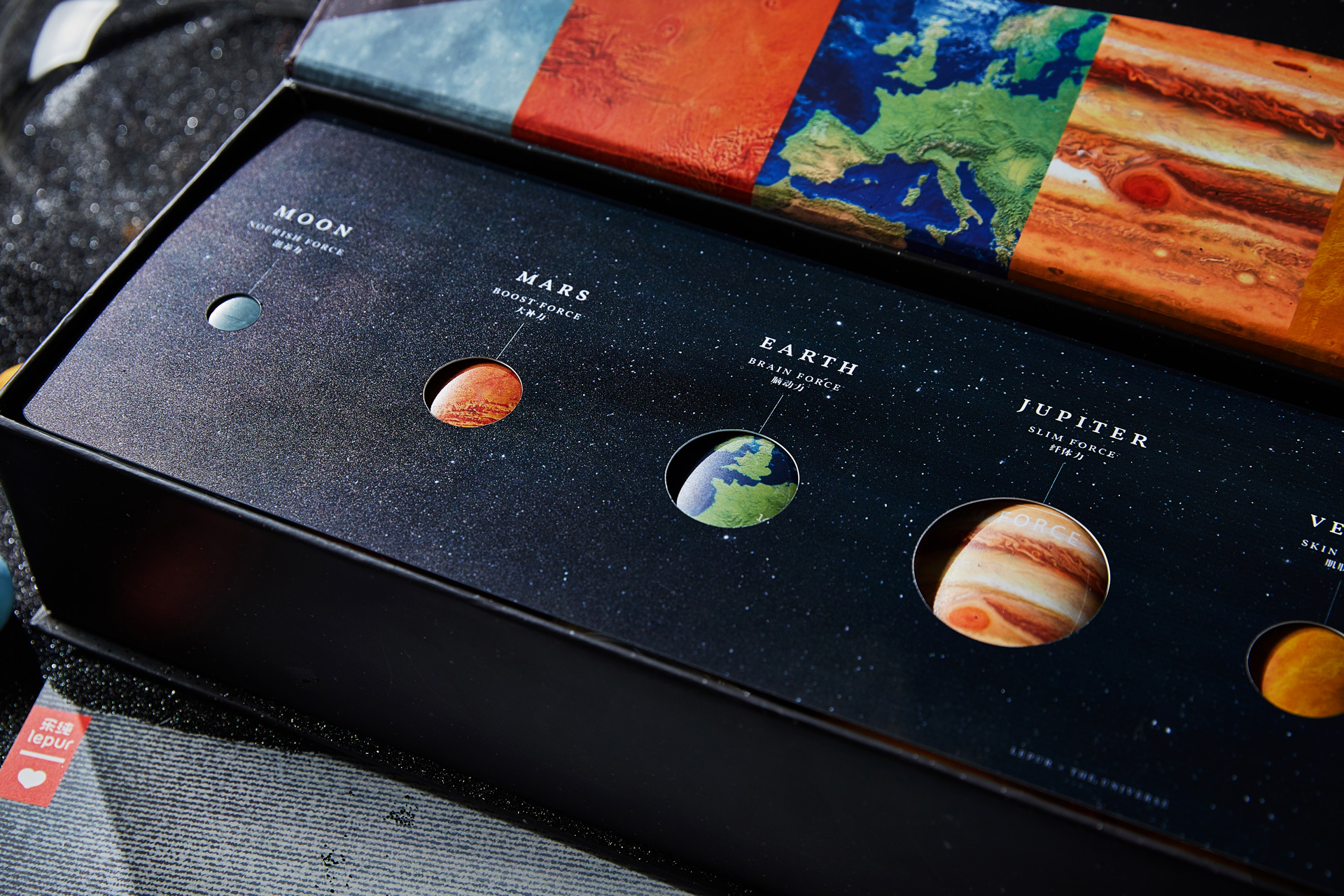
 1. Lepur’s Stardust Box
Inspired by the universe, this meal replacement powder connects the elements of the universe with nutritional elements, and fuses food, aesthetics, and philosophy to give more meaning to meal replacement bottles.
Use the best food experience to protect you and your loved ones, to perceive the greatness of the universe together, to obtain nutrition and wisdom from food.
8 bottles of meal replacement powder correspond to different planets and arrange a weekly calorie control plan. The bottle body uses real and natural planet graphics and detailed textures to connect the elements of the universe with the nutritional elements of meal replacement powder.
Meal replacement bottles come from celestial bodies. For example,Sunday is a day that belongs to the sun, so it is called “Sunday”. The outlook of the stardust Gift Box is a quiet and mysterious universe.
After opening, the design of the cord hollowing structure placed on the bottle makes the planet concept more concrete. Another postcard with a snowflake screen design represents the afterglow of the light of creation, which means the longest existence, and gives the gift box a meaning for loved ones. The light bulb that comes after drinking can lighten up the bottle, showing the beauty of light and shadow, and also realizing the recycling of the bottle as well.
2. Forest Solution Functional Jelly
 This functional jelly is designed to deliver a healthy and positive energy attitude towards life.
The packaging extracts the design keywords from the product name, and extracts the corresponding bright gradient colors according to different tastes. The design pattern is abstracted according to the raw materials of the product. In a form full of texture, it shows the brand’s attitude to help consumers pursue a healthy and high-quality life.
The product are packaged in 7 and 15packages respectively, which are convenient for consumers to carry with, and reminds consumers to stick to it by the quantity to maintain a good healthy lifestyle. The packaging box can be used even after the jelly is eaten up as a pen holder or a vase to reduce waste, and is not easily damaged during transportation.
3. Beak Pick

The expression of both fun and personality is also a major demand of Gen Z that cannot be ignored.
In the West, jam is one of people’s favorite foods, but its high sugar content has given many people a red light on their health. In order to let consumers learn the healthy concept of eating less every meal but having more meals so as to reduce the burden of digestion, the design team creatively combined this jam with a few kinds of birds.
Birds eat very accurately rather than overdose. This should also be the attitude of people eating jam. Jam is”everyday treat”, which needs to be tasted slowly and enjoy the present fun, instead of gobbling. The design captures that the beak of the bird and the shape of the jam ingredients are very similar, and the composition of the two forms a new aesthetic!
As they go deeper into the subject of birds, their lively gaits have inspired design teams to create more interesting creations. The logo section adds the footsteps of the birds. Under the pure white background, its lively and colorful illustrations and black text form a sharp contrast, leaving consumers with a deep impression overall.
4. Lucky Fish Snacks
 As a dried fish snack product, unlike the plastic bag packaging in the market, this blessed fish snack is more meaningful, warmer, more practical, and memorable at the same time.
Therefore, the roles of koi and pufferfish were selected.
In China, koi symbolizes wealth, auspiciousness and well-being; the image of puffer fish is very pleasing.
When it is angry, it will bulge, and it looks really cute, which makes people look very happy.
In order to better reflect the image of the fish, the design team placed the brand logo and main text on the bottom of the box. In terms of of materials, the team chose environmentally friendly cardboard for easy recycling.
Taking into account the product packaging after eating up snacks, there is also some careful thinking at the bottom of the packaging, with a small light bulb switch, the empty packaging becomes a small fish light. The warm light can bring warmth, giving consumers both physical and psychological pleasure.
 5. YOUXIANQI Package of Tea
Youxianqi tea targets at young consumers, aiming to cultivate a new generation of tea drinking habits.
The design team selected parts of the ancient paintings to reflect the historical origins of tea, and combined the pictures with the fashionable words of young people, such as “Keep your health as early as possible, drink good tea until you are old”, “Everygirl is a fairy”, as a way to communicate with consumers and resonate with audience.
Opportunities Outside First-tier Cities
Statistics show that young people in small towns have a stronger consumption power than the entire network, which is reflected in the fact that they buy more, spend more, purchase more frequently, and the potential of the sunk market cannot be underestimated. Compared with products in first-tier cities, products that can sink to non-first-tier cities need to be content-oriented to leisure, driven by practical benefits, and have a certain mass basis. Among them, local products are very representative. In order to win the hearts of young local consumers, local products combined with their brand history are constantly renewing new opportunities.
 1. Walnut Peanut Milk
As a native Chongqing product with a 20-year history, this Walnut peanut milk has always insisted on using real materials for its taste. In order to get closer to the target group, bring familiarity to Chongqing people 20 years ago, and make young people 20 years later interested in this product, this package focuses on showing Chongqing specialties, in order to arouse resonance with consumers.
Combining Chongqing’s “Internet Celebrity City” with the sentimental attributes of the locals, the design team added scenes that have memory characteristics to Chongqingers to the outer packaging.
 Each scene is a place that is worth remembering by Chongqingers, reflecting this product has a taste unique to Chongqing. The palette is also more fashionable and younger, in line with the aesthetics of modern young people. In the illustration, in order to reflect the historicity of Walnut peanut milk, nostalgic brushstrokes are used to further increase the emotional communication between consumers and products.
2. Chang’an Avenue Ice-cream
As a new local ice cream brand, the brand’s target group is young consumers.
The design team noticed that the ice cream brands in the market would innovate on the products: new taste, new fun, new content additions, many selling points and packaging appearance, but lacking the brand’s cultural retention. In order to express Chinese charm and establish cultural value, the design team interpreted the traditional elements of old Beijing on the packaging with youthfulness, so that consumers have identity, cultural identity and spiritual trust, injecting a new cultural spirit into the brand, using youth aesthetic to interpret Chinese culture.
The modern expression of traditional culture has inspired the national cultural identity and spiritual belonging.
3. Lao Sun Jia Plum Juice
 Sour plum soup is a classic drink inthe minds of the older generation. It has a long history and has a good public foundation and market awareness. The Sour Plum Soup of this brand is aspecialty of Xi’an and has strong regional cultural attributes. At the same time, Xi’an has a long history and culture, and the tourism advantage is obvious, which also allows the design team to see business opportunities.
The design team pinpointed the memorypoints of the crowd, used scenes to trigger emotions, and transformed into culture.
Through the establishment of a label system and the use of packaging as a carrier, the impression of Xi’an will be directly passed on to consumers: pictures of ladies, big wild goose pagoda, terracotta warriors … Xi’an inyour imagination is in your hands.
Slimming bottle body meets the needs of post-90s main consumer groups of modern channels and Internet channels. The colors are eye-catching, young and fashionable, and they can catch consumers’eyes in a second on the shelf display. A unique bottle of sour plum soup can have character or precipitation. After more than 800 days of searching, the selenium-enriched plum soup has the rhythm of oriental aesthetics and continues and inherits the vitality of domestic brands.
4. Love Apricot Juice
 At present, the market share of apricot juice products is very low, and brand barriers have not yet been formed. Consumers’ knowledge of apricot juice is still shallow, and the competition’s promotion of products also favor nutritional effects.
The design team explored the advantages of apricot juice in social scenes, proposed a “relieving greasy” positioning for apricot juice, focused on the young group with the concepts of fashion, health, and relieving greasiness, and suggested optimizing the product formula to achieve the vision from quality to strategic unity.
The illustration uses modern methods to portray the apricot production area as fashionable and romantic. The warm yellow apricot is interspersed in the overall layout of cold tones. The combination of cold and warm colors highlights the sour and sweet taste of apricot juice, forming an impressive fresh texture.
 5. Golden Pastoral Dried Fruit Series
Xinjiang specialty dried fruit is becoming increasingly popular in the market, and this packaging cleverly demonstrates the characteristics of the origin in a humorous way.
The design team refined the characteristic culture and landmark scenery of the origin, created a recognizable IP series, integrated the product culture, and created the cultural connotation of visual creativity and product selling point creativity. Creative and bold themes make products more vivid.
 6. Hainan Rice Flour
Located in the southern most part of China, Hainan Island, in its diet history, “rice flour” is one of the rice products that islanders must eat three meals a day. All kinds of Hainan noodles play an indispensable role in the lives of Hainanese.
Uncle Fun started with Hainan’s “lingshui acid rice flour”. He has continuously explored Hainan rice flour culture for many years and inspired to bring the traditional Hainan flour culture back to the table of young people.
Uncle Fun aims to be a protector and promoter of Hainan’s flour culture so that more local young people can take pride in their hometown culture.
The brand is named after the entrepreneur’s name. It takes the entrepreneur exploring and protecting the traditional food and beverage culture as the mainline, and has created a “traditional culture” brand with a young vitality, which personalizes and affiliates the brand. Meanwhile, it makes the brand easy to spread.
The Ultimate Care of Novice Moms
Female consumers are recognized as the main force of consumption, but according to different consumption scenarios, women’s needs can be further refined. The group of novice moms is becoming the focus of brand attention. From self-care to the care of babies, safe and trustworthy are always the first keywords for others. While making products safer and more nutritious, brands also need to convey their characteristics through packaging.

1. Bebi Water
As there is very little safe water available for mothers and babies on the market, this brand hopes to make a safe drinking water specially designed for mothers and babies to give children and mothers more protection and convenience.
The design team uses 12 illustrations to uphold the concept of love, warmly caring for the mother and baby, and closer parent-child relationship.
In order to take care of the mother’s need to prepare the baby’s milk powder, the packaging uses a small bottle, which can be used only once to reduce pollution, and are also convenient to carry for children, making mothers and babies more comfortable and safe with water.
2. Nestlé MOM Single Serve Packaging
The target consumers of this milk powder are pregnant and lactating mothers. As China‘s urbanization rate continues to grow, 80% are working mothers, and they are pursuing an efficient and convenient lifestyle to adapt to their fast pace of life. The mainstream packaging of mother’s milk powder commonly used in the market is usually in large barrels, large boxes or other packaging styles that are not convenient for daily carrying. The independent convenient packaging is still unavailable in the market.
This product meets the needs of the target consumer group for the convenience of packaging, while focusing on the characteristics of “low fat, 0 added sucrose” to facilitate weight management.
 Product innovation uses independent portable packaging, built-in 10 bags of 35 grams of independent packaging, one bag at a time, convenient to carry and safe and hygienic, to meet the needs of nutritional supplementation during pregnancy anytime, anywhere. The packaging is designed with a double-sided waist, which conveys the core selling point of the product “low fat, 0 added sucrose to help control weight”.
The unique waist design also makes the package more differentiated as a whole; the front adopts 3D cat-eye technology to enhance the overall packaging grade, while also emphasizing the product’s rare A2 formula ingredients; a vertical card design is used at the top to help improve the shelf impact of the product; the back shows an illustration in the form of three high frequently incited situations-after exercise, during work and when listening to prenatal music.
The mother’s milk formula is quoted in the scene to show the unique advantages of the product being convenient to carry anytime and anywhere to meet the nutritional needs, of pregnant women.
3. Adopt A Cow Cheese Lollipop
The concern for the mother group is also reflected in the optimization of children’s food. Not only is the formula more suitable for children, but it is also intellectual and helps to develop children’s intelligence.
The target group of this cheese stick is children from 3 to 12 years old. In order to bring long-term accumulation to the brand, they have chosen to create their own IP to create brand new products. It also provides a foundation for future development of peripheral products.
 In the choice of IP, considering that the age of 3 to 12 is also the time when children are most curious about unknown things, the design team chose the ancient creatures that have disappeared from the earth-dinosaurs, 6 cute and funny baby dinosaurs, can attract children, immediately.
At the same time, a lot of small quizzes about dinosaurs are set on the product packaging, so that children can learn knowledge while enjoying the delicious lollipops, which is good for intelligence and arousing interest.
4. Baby Standard Biscuit
The target group of this infant biscuit is mostly the new generation parents. These post-85s and post-90s parents have new parenting concepts, pursuing scientific and efficient way. From refined feeding to refined child care, parents pay more attention to the best care for the baby in details.
 Considering that most of the domestic infant food supplement brands are marked by the words “Infant and Toddler” and “Baby Only” as product promotion highlights, but few products implement infant standards in ingredients.
Selecting ingredients and strictly controlling the added complementary food products, the design team innovatively put the product’s ingredient list on the front of the package, directly telling consumers the most critical advantage, which is also a bold innovation in the entire infant and young food packaging market.
For parents with parenting ideas, they have greatly increased their trust in the product, formed a direct recognition of the product and attractiveness of the product, and enhanced the impression of no added products.
In addition, the design team also created a brand IP-the baby in tiger head clothes. This affinity image can well arouse consumers’ favorability for the brand, and at the same time can tell consumers that this is an infant food. In form, the design team chose a combination package, full meal ingredients, away from partial nutrition, to solve the problem of complementary food choice for parents, different colors represent different tastes, and one box can meet the needs of the baby.
Conclusion
The continuous segmentation of the consumer market brings not only many opportunities for brands, but also huge challenges. Back to the beginning, how to use packaging design to impress your target group with your product? It is not difficult to find out from cases above that you first need to have a clear understanding of your own product and a clear positioning of the core characteristics in order to focus on the target group. Secondly we are supposed to deeply explore the needs of the target group and the reasons behind the needs, and build a bridge of communication. The most important thing for building this bridge is to stand in the perspective of the target group and look into the problem from the perspective of the target group.
Previously published on FBIF