How To
How to get your new soft drink idea to stand out

When I was a kid soft drinks were available in two forms: fizzy and squash. Squash came in orange, blackcurrant and lemon flavours and was boring, while ‘pop’ had loads of fabulous flavours including dandelion & burdock, cherry and cream soda but was, according to my parents, unaffordable. Getting hold of the mythical ‘Coca-Cola’ was about as likely as my Dad coming home in a Bentley.
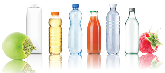
Times have changed a bit since then. Entirely new categories of soft drinks have been created by the unstoppable forces of capitalism and innovation: Bottled water, energy drinks, juice drinks, diet drinks, smoothies, ice teas, isotonic drinks, wellness drinks, brewed soft drinks and so on, and on, and on.
How on earth does the consumer decide which of these to drink, and when? More importantly for the purposes of this article, how can an entrepreneur with yet another great idea for a drink get it noticed?
The consumer is King. And Queen
The first principle of marketing is to start with the consumer and their needs, but surely with all that stuff on the shelf there can’t be any needs left, can there?
Actually there are plenty. Not in the sense of actually quenching a thirst, perhaps, but people’s ‘needs’ in our consumer society have moved on. We can nearly all afford pop (even Coca-Cola), but what we choose isn’t so much about price any more. It’s about defining who we are.
Of course this isn’t limited to soft drinks, or drinks in general. We define who we are by what car we drive (or by not driving), what perfume we wear, what smartphone we bury our heads in and even which brand of granola we eat. Brands are the currency of identity, even when we shop at Lidl and purport to avoid their siren call.
But where does that leave our ‘Drinkpreneur’? Creating a brand, not a product, I would argue. If new products fail 80% of the time (you choose your favourite statistic), then in 90% of those cases I would say it was because no real brand existed.
Your brain wants a story
When people see a new product with new things to offer, the first thing they need is a reference. What KIND of product is this? Who makes it? Do I trust them? How will consuming this make me feel? How will it make me look?
These questions are not consciously asked, of course. They are asked – and answered in milliseconds – by our subconscious ‘System 1’ circuits before we are even aware that we were thinking about buying something.
Yet something must have triggered our attention in the first place, so what was it?
The neuroscience tells us that we are attracted to objects and communications by association; something in the environment evokes a need we are subconsciously carrying around, and we pay attention. At this point our brain 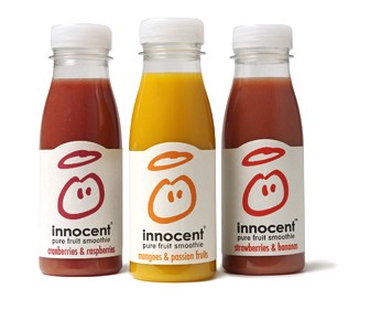 goes into overdrive to assign it a category, a function, a personality. It simply has to know.
But because System 1 has evolved to be lazy (why waste time and energy actually thinking?), it looks for the quickest way to understand all of this new stimulus together, as a bundle.
It turns out that the most efficient way to for it to do this is to make up a story, so it helps if we’ve already designed one into the packaging. And real brands have better stories than products with a name and some claims.
Let’s look at a few high profile examples:
A perfect packaging story
When this packaging hit the shelves it changed the rules not just for soft drinks but arguably for all food packaging. Its job was to define a smoothie, an entirely new category of drink (more a nutritious snack, actually), and to establish the innocent brand as its new leader.
The first thing System 1 notices is a cute little bottle with a pure and simple form. Despite its small size the wide mouth and fulsome shoulders make it look packed with richness. The shape is familiar, and a quick memory check identifies it as an old-fashioned milk or juice bottle, ticking the ‘wholesome goodness’ box.
The label has no fruit pictures on it, just a childlike character that reinforces the meaning of the name – angelic, naive and pure. The paper stock is a tactile and unbleached, which System 1 knows is associated with raw, unprocessed ingredients.
The little ‘blip’ in the l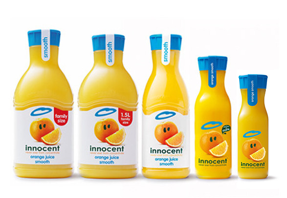 abel shape attracts attention but also has hidden meaning – it had to be ‘cut out’, so this brand has taken care of the product.
We need System 2 to do any actual reading so here goes: ‘Cranberries and raspberries’. Those sound like the actual fruits, and on the back of the pack there’s an even more unfamiliar landscape. The ingredient list contains cute illustrations of fruits and tells me how many of each: ‘27 cranberries, 15 raspberries, etc.’ The company address is ‘Fruit Towers’ and they want you to call them on a banana phone?
Every element of this packaging design builds an incredibly rich brand story, with no need for advertising or even a website. Of course they had a grass-covered van, cool events and fantastic PR, all of which were part of the story that was already deeply encoded in this pack.
Years later, and then partly owned by Coca-Cola, they took on Tropicana in the juice market, once again using packaging (an elegantly-sculpted carafe) to tell an instantly recognisable story for System 1 to decode (fresh juice on the breakfast table).
‘Power up’ packaging
Here’s the design that defined another new category – energy drinks. What does System 1 make of this on first sight?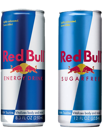
The can is slimmer than normal soft drinks, so it’s more of a concentrate, or perhaps a ‘dose’. Thanks to the silver and blue sharps it looks more like engine oil than a drink, reminding my subconscious of fuel. There’s a mini-explosion of red and yellow at the centre of the pack, and the name Red Bull, suggesting aggression and power.
Red Bull is a world leader in content marketing, yet even without its sponsorship of Formula One and a panoply of extreme sports, this pack tells my brain an innovative yet decodable story.
Now that we’ve all learned the codes of energy drinks (check out some competition here and here), Red Bull has developed a portfolio of products to satisfy consumer demand for more flavour choices.
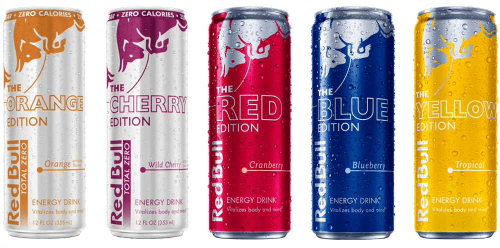
But rather than use the famous core brand design and somehow introduce colour codes (this would dilute the brand power, though it has been done for low- and no-sugar variants), the brand has introduced a totally new design system for special editions.
These are elegant designs in their own right, but only understandable in the context of Red Bull’s global fame. Therefore this is not a path I would recommend to a Drinkpreneur until after you’ve done the same.
Shrink to fit
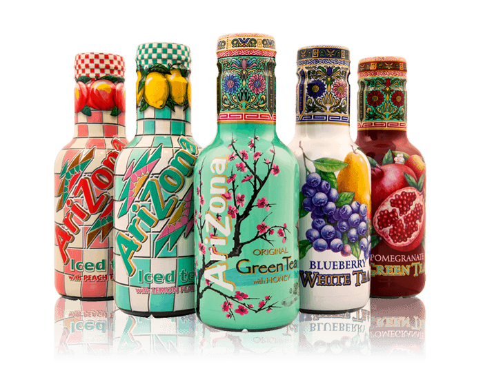 The ability to sleeve any shape of bottle has radically transformed the innovation potential of soft drinks. Labels need a decent amount of flat surface which of course restricts the shapes designers can create; but whilst all bottles need some technical restrictions to run down a filling line, sleeving permits all kinds of compound curves and thus storytelling metaphors that were previously unattainable.
Somewhat ironically this bottle does not need to be sleeved at all, but when Arizona decided to use this new tool they used it in spades, creating a 3-dimensional canvas of bright patterns and intricate illustrations that cover every millimeter.
Both the bottle shape and graphic style have a charming naivety to 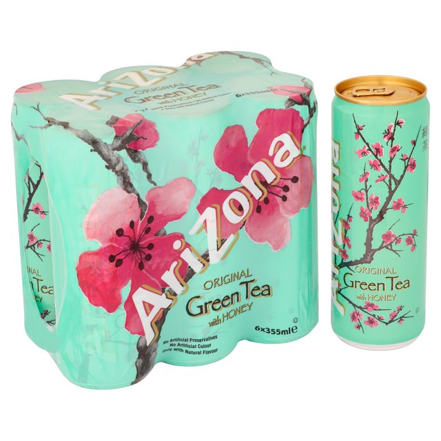 them that suggests a slightly hippy, natural, even organic lifestyle. And all this using acres of stretched plastic – I told you System 1 was lazy.
In exchange for all this design real estate you need to give up seeing the product, but that’s not always a bad thing if the gallon bottle is anything to go by (enough to make me instantly stop believing the Arizona story). But on the plus side, it’s a design language that perfectly suits another bane of the designer’s life, the 6-can shrink sleeve.
Hydration stations
In many ways water represents the peak of the storytelling prowess of packaging. I could wax lyrical all day about the way Evian added a mountain of value to natural spring water, but in some ways the packaging of functional waters is even more impressive.
Over recent years we’ve all had health management messages drummed into us, about fat, cholesterol, sugar, diabetes, anti-oxidants, free radicals and of course hydration. Great, but just you try drinking 2 litres of tap water a day.
 But once I’ve decided to be that person who ‘looks after himself’, my System 1 doesn’t need to be asked; it’s already looking for signals in the environment to help me.
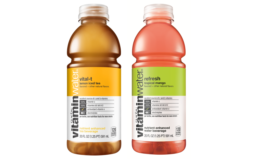
Despite its descriptive name (The Glaceau brand is a subtle but essential endorsement), vitamin water hits all the hot buttons. Inside it’s plain water with a few readily available metabolites and a nice colour added. But with the extra power of packaging, it’s an Aladdin’s cave of jewel-like pharmaceutical life-boosters!
How does System 1 come to this conclusion? Well let’s start with the bottle, a grabbable handful that’s based on a sports ‘bidon’. The translucent cap appears to merge with the bottle itself, suggesting purity and also design intent, a rather abstract notion that System 1 nevertheless recognises and reads as ‘purposeful’.
The label is large and made of a loose-fitting, plasticky material that has ‘technology’ written all over it: Both metaphorically through its form, and literally because of the pharmaceutical codes of detailed instructions and info panels, largely spelled out in serious black and white.
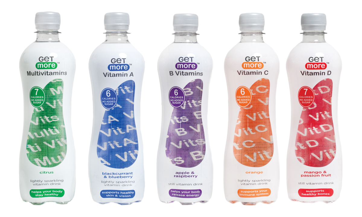
I’m seeing a drinkpreneurial rival in many UK stores at the moment, from a brand called ‘Get More’. This is an eye-catching bottle thanks to its use of the ‘window to the back label’ strategy.
That arouses my curiosity, and I’m willing to fire up System 2 to check out the messaging – yep, it’s vitamin water.
However the slender curvaceous bottle sleeved in white with primary colour codes doesn’t feel very ‘watery’. The window itself reminds me of a stomach or maybe a kidney, hence highly functional, yet the typography and name ‘Get more’ don’t quite add up to a convincing pharmaceutical story.
It’s not for my System 1, but I can sense its appeal to women looking for a nudge in the right direction, as they pick up a healthy meal deal for lunch.
The soft drinks world is extremely dynamic and new concepts, products and brands are constantly appearing on the shelf. I spend a lot of my time wandering through supermarkets, looking for ideas that have ‘caught my eye’ from shelves that are simply laden with wannabe innovation.
What’s your story?
As a consultant I will look at the good, the bad and the ugly in an attempt to understand ‘what the brand is trying to say to me’. As a consumer I’m only interested when System 1 whispers: “Yes, this is what you’ve been looking for”.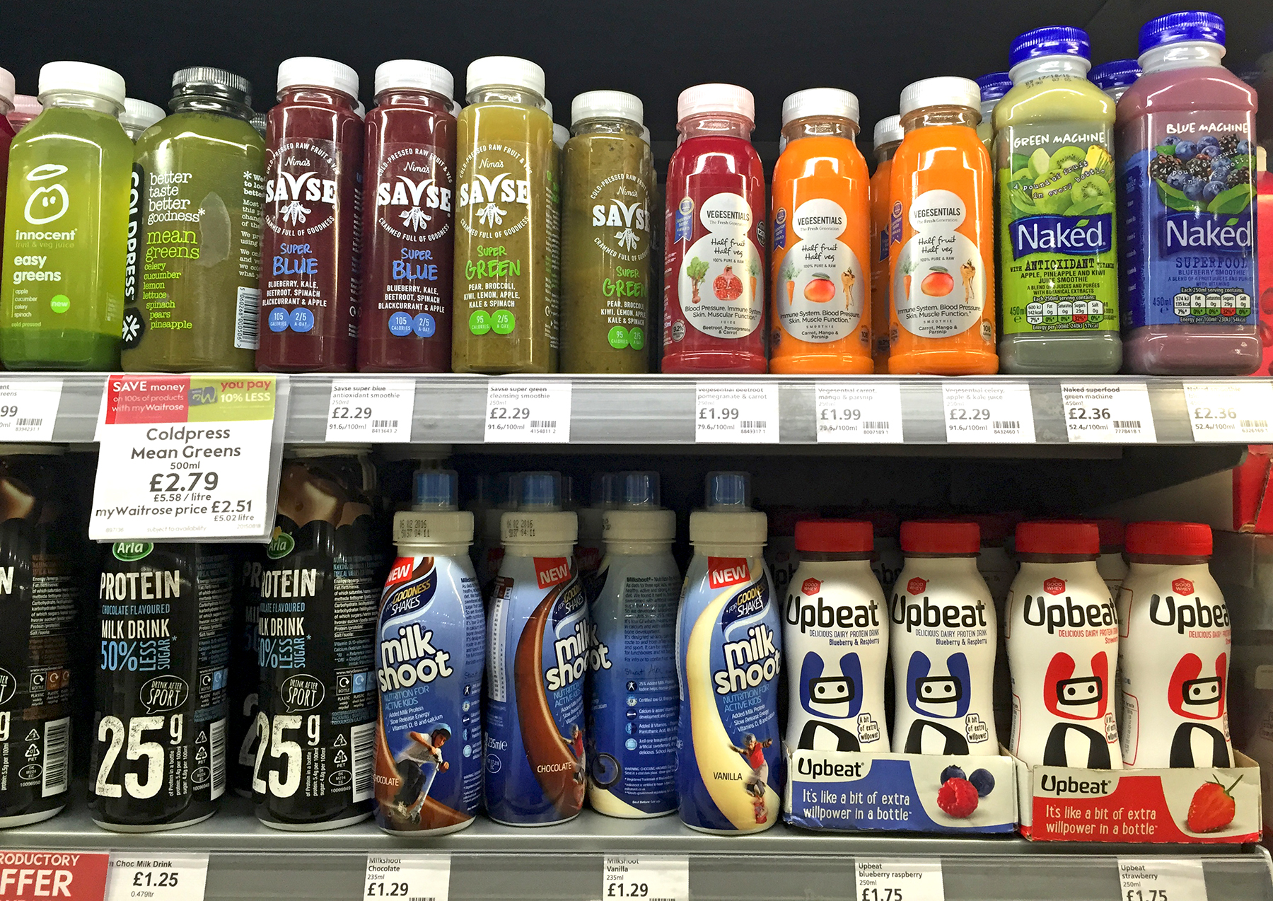
Here’s a typical scene in Drinkpreneur land, a range of healthy drinks from two different categories. I’m seeing the generic, the unpronounceable, the invisible, and the artificial.
But one or two are clearly standing out with a motivating story that I can relate to. Make that your target and your innovation just might fly.
You can find a lot more analysis of how packaging encodes brand stories and how these perform on the shelf in my blog, ‘Shelf Life’, available here.